I’d be willing to bet that when you put together a website and are looking to choose a color scheme, you look for something that ‘looks good.’ That’s perfectly fine, but you’re missing an entire area of consideration when that’s the end of your color decision process, and that’s color psychology.
We dipped into this topic not long ago while discussing turning budget web design clients into real money makers, but it’s such an important topic it deserves its own article. It really can make a considerable difference for your client if you understand color psychology and how it affects the browsers, and can even help in the process of conversion.
So what is color psychology? The idea behind color psychology is that every color we come in contact with elicits a response in our brain and gives us an emotion. Managing those responses and emotions to help achieve a goal is a way you can make your web design that much more beneficial to your client.
Let’s look at some examples:
Using Green in Web Design

Green suggests to us power and growth, and should be used for more than just nature-related sites and environmental sites. It’s also a good color to include in sites such as TD Ameritrade, as it subtly suggests to the browser that the adviser can help their finances grow.
Using Blue in Web Design

When you think of the color blue on the internet today, one of the sites that probably comes to mind is Facebook. They clearly aren’t strangers to color psychology as the color blue suggests integrity, trust, and friendship, all things the site would like the browser to think of, though perhaps to varying success in their case.
Using White in Web Design
It can be easy to overlook white when thinking of colors, but in color psychology it provides a very important role. It suggests purity, or purity of intention. While it’s likely that many sites use it without color psychology in mind, it’s always a wise color to include in any business website.
Using Black in Web Design

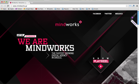
Exclusivity is what’s suggested by black. This is one of the key reasons why many banks and credit card companies have done away with their platinum cards being without a limit, in favor of the black card. It suggests that getting a black card puts you in an exclusive club. A prime example of this in action is American Express.
Using Yellow in Web Design
 In the right setting, yellow can be a very important color. It suggests intellect and superior minds. University of California, Berkeley, for instance, has several insertions of yellow on their website, as well as blue.
Using Red in Web Design
 Those who are versed in color psychology would probably suggest the color red is underused in the business world, as it seems to suggest everything a business should be going for: energy, passion, and action. All good things to look for in a mutual fund, which is why Vanguard mutual uses the color heavily.
Other Examples of Using Different Colors
Now that we’ve covered a few specific colors, let’s take a look at a couple websites and see how they put color psychology to use in their own marketing.

Wells Fargo‘s site is almost entirely white and red, with hints of gold which suggests they have a purity of intent and will take action for you. These are great traits someone looking for a bank should keep an eye out for, and they clearly know it.
 Reddit, for those who aren’t aware, is a niche site, but has a huge audience and a very unique culture. Their homepage, or front page as they call it, is filled with white, blue, and a touch of black, suggesting they’re pure, a place for friends, but also exclusive. Those familiar with the site would likely attest to how accurate that is of the culture.
Putting the mind to use in creating the best site possible for your clients is important. While finding colors that look good together is obviously important, knowing what those colors suggest to the browser can help you go one step further in providing a quality site to the client that will work in ways they never imagined possible.
What are your thoughts about using different colors when you build a site?