
Web designing is a process of integrating new stuff into the design, and making the web page look updated and great according to the newest available technology and techniques. And, responsive designing is the new thing in trend. Responsive sites are basically the ones, which adjust their dimensions and size according to the device’s screen size, and dimensions, on which it is being opened or operated on. It is very easy to be designing a responsive web page, but anything requires some training and tutorials to be learned before implementation.
A good tutorial is something, which teaches the importance and required stuff in the least possible time, and with the least complicated content and data. It is all about conveying the message to even the most newbie person reading it. We learn stuff the best way using these type of tutorials. For responsive web designing, there are thousands of tutorials available web-wide. These offer cool and amazing features and level of teaching, in the best possible way. The desired code, the desired placement of the code in the best possible way, and other stuff, a good tutorial will teach the same very easily and effectively.
There are thousands of tutorials available online, and if you try on reading each one of them, you will end up getting confused and nothing else. A collection of some of the best web designing tutorials, which will help you master the technique of making a web page responsive, and making you capable of doing it on your own, is given below. These have the least complicated data, and are very easy to understand and implement.
1) Build Basic Responsive Site CSS
In this tutorial, the principles behind responsive web design in detail, When a developer building a websites that scales perfectly on both large and small screens. Responsive web design has mainly become a hot topic because more and more people are using mobile devices such as iPhones, iPads, and BlackBerrys to access the internet.
So it’s becoming increasingly important to understand that a website should not be specifically about either the desktop or the mobile device, but about building in such a way that its layout adapts to varying viewport sizes.

2) How to Design a Mobile Responsive Website
IN this tutorials, you can about how to make a responsive web design for mobile devices.

3) How Add Responsive Video Your Website
The web design industry is evolving at a rapid pace. So, sometimes, we need to adjust our design and development techniques to account for new technologies. Nowadays, responsive web design is advanced technologies for everyone, you can embedded videos on the sites similar as images.

4) Responsive Web Design Layouts and Media Queries
A responsive website is a website that will respond and adapt to the user’s behavior and screen size. The idea is to resize and reorder the design, adapt images, typography, columns, etc., based on screen – browser size, resolution and orientation instead of providing each device a specific website.

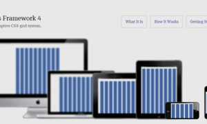
5) Design Sites Using Responsive Grid System
The Responsive Grid System isn’t a framework or a boilerplate. But it does make creating responsive websites quick and easy.

6) Handling Typography Responsive Design
Responsive web designing is a Wonderfully fluid grids and media queries making our designs fit screens of any size. In this tutorials you will learn how to fit a type into a responsive web design site.

7) Create Fluid Layouts HTML5 and CSS3
In this tutorials, designers and developers can get the knowledge about how to create fluid layouts HTML5 and CSS3 responsive sites.

8) Responsive Web Design a Visual Guide net
According to this guide, you can learn about how we can fit a sites on every devices and


