
Designing part of any website is not a easy task for web designers but nowadays with the help of some resources you can build a complete website with some attractive designs including header design, Menu design, background design, flash design, body design, etc in just few simple steps. You will find a responsive web design that can fit any size of screen. Over the internet a lots of useful resources available for help and guide designers as cheat sheets, online tools, frameworks, and much more, help to make a better responsive web pages. Today we are going to shared some best responsive frameworks for web designers.
A few days ago, we had covered some best resources for our readers like online HTML5 tools that help to make a better web design, HTML5 cheat sheets that help for guiding a lot, online books and much more. And today we collect some best responsive frameworks for web design. Visit this list and share your thought with us.
1) Gumby Framework
Gumby 2 is built with the power of Sass. Sass is a powerful CSS preprocessor which allows us to develop Gumby itself with much more speed — and gives you new tools to quickly customize and build on top of the Gumby Framework.

2) Get UI Kit
A lightweight and modular front-end framework for developing fast and powerful web interfaces.

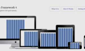
3) Foundation
This is one of most advanced responsive framework for web design.

4) Semantic
Semantic empowers designers and developers by creating a language for sharing UI. Semantic gives you a variety of UI components with real-time debug output, letting your code tell you what its doing.

5) 52Framework

6) PureCSS
A set of small, responsive CSS modules that you can use in every web project. Unlike other frameworks, Pure’s design is unopinionated, minimal and flat.

7) Responsablecss
Responsable uses the power of less and sass to bring you a perfect responsive framework.

8) TukTuk
The premise is to use as much as possible the features of the latest CSS specification. The purpose is to encourage code reuse plus faster and more efficient stylesheets that are easier to add to and maintain.

9) Kube
Kube is one of the world’s most advanced and flexible CSS-frameworks. It gives you full power of choice, creativity and beauty, while handling all of the technology behind it. No more boring routine, just concentrate on something big and wonderful, and let Kube provide the rest.

10) Ivory
IVORY IS RESPONSIVE FRONT-END WEB FRAMEWORK MAKES YOUR FRONT-END DEVELOPMENT FASTER AND EASIER.


